

How a Bodega-Inspired Typeface Got Zohran Mamdani Elected.
On November 4th, I joined the world from Lower Manhattan and watched New York City elect its 111th mayor.

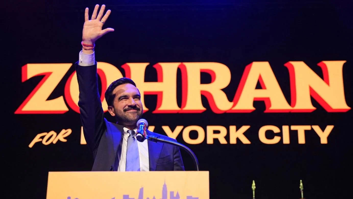
Stood poised behind a branded dais, against a backdrop of the American flag and the boroughs he campaigned to govern—noticeably, Brooklyn’s flag slightly cropped in ABC’s broadcast—Mayor-elect Zohran Mamdani delivered his galvanizing victory speech at the Brooklyn Paramount Theater, addressing a crowd of energized and unbridled New Yorkers. The audience roared in unison, their approval echoed through Flatbush and DeKalb Avenues, reverberated outwards across the other boroughs, the nation, and even the world.
His victory was no speculation. His pledges for affordability and universal child care, among other campaign promises, steered his path to triumph with a commanding 50.4% of the vote—a clear seal of approval. Yet more subtly, an overlooked element helped steer his winning ship: his campaign brand.
Mamdani’s campaign drew visual cues from New York’s collective subconscious—most notably, the marigold yellow of its taxis and a handmade typographic style reminiscent of posters plastered across independently owned bodegas. These visual choices, among the campaign’s most effective, referenced not only icons of the New York landscape but also cornerstones of community-building.
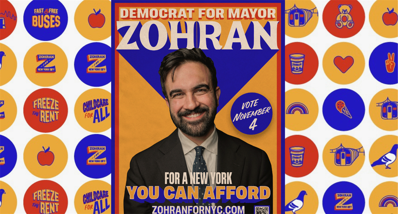
We have long accepted the absent-minded design process, in governmental projects, as a bureaucratic norm. But Mamdani rejected that careless insouciance; he did not underestimate the role design and digital presence play in mobilizing voters. His campaign identity, crafted by Philadelphia-based design cooperative Forge, departed from the habitual red, white, and blue that has long been synonymous with American patriotism. Instead, it adopted an atypical color palette, illustrated landmarks, and bold typographic declarations. The result was a brand system that felt personal, human, and distinctly him, not manufactured by AI, but crafted in his self-image—energizing and building a genuine constituency of voters.
Through this solicitous brand kit, Mamdani demonstrated who he is—and not just a political attitude that is participatory and conveniently strategic for his electoral success. Nothing kills authenticity like pretending to care.
The design drew inspiration from the ordinary—its streets, its people, its pulse. New York itself was both subject and influence: the immigrants he sought to empower, the working class he vowed to uplift—all of them, New Yorkers. While his brand system subtly nodded more to the Mets than the Yankees, Mamdani’s win promises to rectify the ideals of New Yorkers who now, as he declared, are all playing on the same team.
I remain eager for January 1, 2026.